This is a plain-text explainer of a recent paper published in the American Journal of Epidemiology. There has been increasing evidence in the literature that spatial clustering of non-vaccination contributes to outbreak risk. However, there is no best practice on how to measure this spatial clustering, or what scale of data is best equipped to assess outbreak vulnerability. In this paper, we address this gap in the literature and evaluate potential biases that may occur when using different spatial clustering metrics and spatial scales in order to provide guidance for best practices.
Even if there is an effective vaccine, non-medical exemptions (NMEs) create a risk of outbreaks
The measles vaccine is very effective, and has enabled the US and other developed countries to contain measles cases in recent years by mandating vaccinations for children. Nonetheless, 2019 saw huge measles outbreaks across the United States. The outbreaks were due to pockets of unvaccinated children, often with non-medical vaccine exemptions (NMEs). Parents who do not want to vaccinate their child for philosophical or religious reasons can currently get an NME in 45 states (all states except for California, Maine, Mississippi, New York and West Virginia). So what can be done to measure and locate the risk from NME clusters?
We need to measure NME clusters to identify high-risk areas
Many studies have shown that more NMEs lead to increased outbreaks of vaccine-preventable diseases (VPDs), particularly when NMEs are clustered. In fact, exempted children are up to 35 times more likely to contract measles, and 6 times more likely to acquire pertussis. Communities with high rates of NMEs allow pockets of susceptible children to come into contact with each other, creating an environment perfect for the spread of disease. It’s important to identify clusters of NMEs to target local pockets of susceptibility to disease, but there is no ‘best practice’ for how to measure this spatial clustering. There are many clustering metrics available, but most are drawn from the fields of statistics and geography, and are not designed to assess the transmission risk of a disease.
How did we measure clustering?
We assessed 4 different metrics in this paper. The most commonly used is Moran’s I, which measures how similar observations are near to each other – technically called “global spatial autocorrelation.” Essentially, a checkerboard would be one extreme (a value of -1) where all the non-vaccinators are dispersed between vaccinators, and a black and white cookie would be the other extreme (a value of +1). Moran’s I is commonly used to measure clustering, but it doesn’t have a clear epidemiologic interpretation, because it doesn’t distinguish between a pocket of 5% non-vaccinators in an area with 95% vaccinators, vs. a pocket with 5% vaccinators in an area with 95% non-vaccinators, though these two situations obviously have very different disease risks.


The Isolation Index measures something different: how much exposure members of a minority group have to one another. In this paper, the isolation index measures the probability that a kindergartener with a vaccine waiver would come into contact with another student with a waiver, with higher values indicating more clustering. The Modified Aggregation Index makes a small tweak by restricting the formula so that there have to be at least two unvaccinated students in a school.
You can explore these metrics in an interactive way here.


Lastly, the Theil Index has been used to characterize scales of racial residential segregation, and can be decomposed into within- and between-group heterogeneity. This doesn’t really have an interpretation in terms of disease risk, but is useful for understanding how different scales might bias results by clumping heterogeneous vaccination landscapes into one aggregate estimate.
What level of data should be used to locate likely outbreaks?
This paper demonstrated that aggregating school-level vaccination data to the county or state level can lead to large biases in identifying the number of at-risk students: for 10% or 20% waiver thresholds, when we aggregated data to the county level, the number of at-risk students was underestimated by 82.2% and 99.8% respectively. This shows aggregate data is unable to identify local pockets of high waiver rates. This is a huge problem because most public reporting of vaccination rates is currently at the county or state level.

Beyond identifying at-risk students, how did these different metrics perform at different scales?
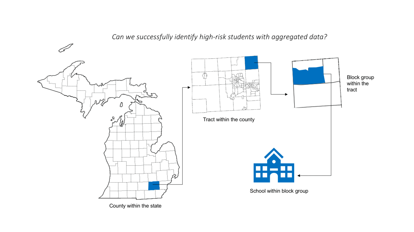
To assess how well each of these measures predicted outbreak risk, we applied them to Michigan’s vaccination data from 2008-2018. We calculated each of these statistics each year at the school, block group, tract, school district, and county level. We also looked at how the at-risk population (measured by how many students were in a school with waiver rates over >5%, >10%, and >20%) changed as we aggregated the data.

The different metrics behaved differently as the level of aggregation changed. Moran’s I increased as the scale became more zoomed out, which makes sense because Moran’s I measures clustering of like values, so reducing fine-scale noise makes the value bigger. By contrast, the Isolation and Modified Aggregation indices had the largest values at the finest scale of data. Finally, the decomposed Theil Index showed about 56% of the heterogeneity in vaccination waiver rates occurred within school districts, showing that a lot of spatial uncertainty is smoothed over by using fairly small aggregate levels. Like Moran’s I, the Theil Index does not indicate outbreak risk, but the Theil Index is very useful for understanding bias in surveillance estimates.
Which metrics should be used in the future to measure outbreak risk?
This paper shows the importance of choosing the most appropriate clustering metrics for disease-relevant interpretations. This paper, and our recent PNAS paper, both showed a strong correlation of the Isolation Index to outbreak probability and size. We therefore believe that the Isolation Index should be used to measure NME and other disease clustering applications.
Strengths and limitations
This paper used very granular data and thoroughly went through different clustering metrics for a robust ‘best practices’ assessment. However, we only used kindergarten exemption data, so we don’t show the full picture of all students in the state of Michigan. We also didn’t separate exemptions by type in this analysis (stay tuned, a future paper is doing just that!). Nonetheless, this study has other notable strengths: this data source represents all schools with at least 5 students in Michigan, and uses school-level data, which are appropriate to use as a ‘gold standard’ for VPD risk.

Leave a comment